Unlocking Success: 20+ Key Design Elements for an Effective WordPress Website
In today’s digital landscape, your website is often the first impression potential customers will have of your business. With WordPress powering over 40% of all websites on the internet, it’s crucial to not only stand out but also create an experience that keeps visitors engaged. But how do you transform a simple website into a powerful online presence? The secret lies in understanding and implementing key design elements that drive effectiveness and user engagement.
In this article, we’ll explore over 20 essential design elements that can elevate your WordPress website from ordinary to extraordinary. Whether you’re a seasoned developer or just starting out, these tips will help you create a site that not only looks great but also functions seamlessly. From intuitive navigation to striking visuals and mobile responsiveness, we’ll break down what makes a website truly effective. So, grab a cup of coffee, get comfortable, and let’s dive into the world of WordPress design that can transform your online space and captivate your audience. Your journey to a standout website starts here!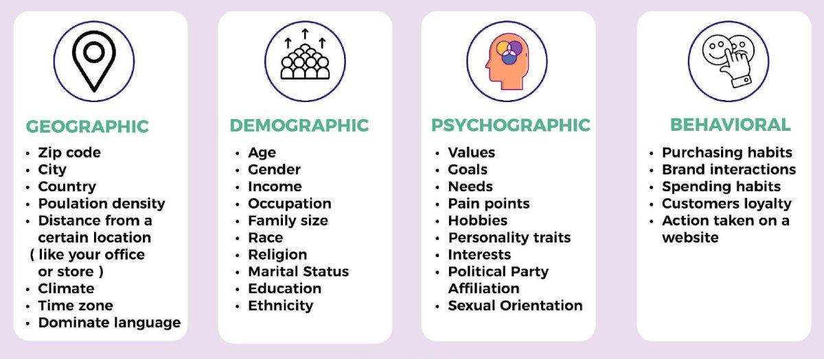
Understanding Your Audience for Tailored Design
To create a WordPress website that truly resonates with your visitors, it’s essential to delve into the psyche of your audience. Understanding their needs, preferences, and behaviors will enable you to design a site that not only attracts but also retains their attention. Start by identifying who your audience is; this involves segmenting them based on various criteria such as demographics, interests, and online behavior.
Once you have a clear profile of your audience, consider the following key aspects:
- Visual Preferences: Different demographics may respond to varying color schemes and typography styles. For instance, younger audiences often favor bold colors and playful fonts, while older groups may prefer more subdued tones and classic typefaces.
- Content Consumption: Determine how your audience prefers to consume content. Are they more inclined towards videos, infographics, or traditional blog posts? Tailoring your design to incorporate these formats can enhance user experience.
- Navigation Habits: Understand how users interact with websites. Simplifying navigation and ensuring intuitive layout will help users find what they need quickly, reducing bounce rates.
Additionally, consider creating user personas, which are fictional characters that represent segments of your audience. These personas can guide your design choices, allowing you to make decisions that cater specifically to the needs and motivations of your target users. For example:
| Persona | Age | Interests | Preferred Content |
|---|---|---|---|
| Tech-Savvy Millennial | 25-35 | Gadgets, Startups | Videos, Blogs |
| Busy Parent | 30-45 | Parenting, Health | Infographics, Quick Tips |
| Retired Individual | 60+ | Travel, Hobbies | Articles, Newsletters |
By employing these insights, you can create a more personalized experience. Small adjustments in design elements, such as button placements or font sizes, can significantly affect how users interact with your site. Remember, the ultimate goal is to cater to your audience’s needs; this not only enhances user satisfaction but also fosters loyalty and encourages repeat visits.
Choosing the Right Color Palette to Evoke Emotion
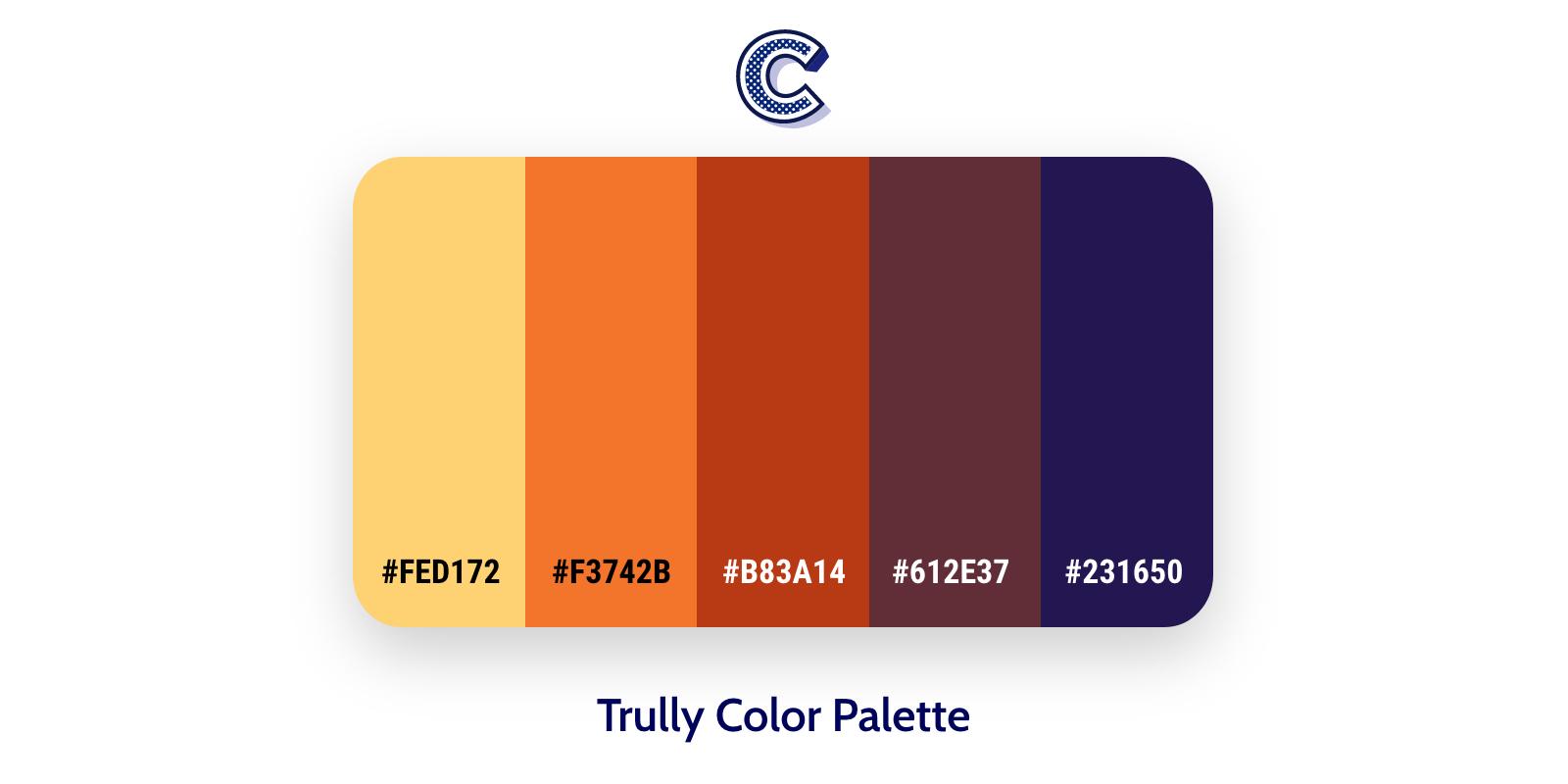
Colors are not just visual elements; they have the profound ability to influence emotions and behaviors. When designing a WordPress website, selecting the right color palette can transform the user experience, evoke desired feelings, and enhance your brand’s message. Understanding the psychology behind colors is essential for creating a powerful emotional connection with your audience.
To effectively convey emotions through color, consider the following important aspects:
- Warm Colors: Shades of red, orange, and yellow can evoke feelings of excitement and warmth. These colors are perfect for calls to action or sections where you want to promote energy and enthusiasm.
- Cool Colors: Blues, greens, and purples are calming and serene. They are ideal for brands that want to convey trust, relaxation, and professionalism.
- Neutral Colors: Whites, grays, and blacks provide balance and sophistication. They can serve as an excellent backdrop that allows other colors to pop while maintaining a clean and modern look.
To help you easily visualize the impact of different color combinations, here’s a simple table showcasing color meanings and their emotional responses:
| Color | Emotion Evoked | Common Use |
|---|---|---|
| Red | Passion, Energy | Sales, Promotions |
| Blue | Trust, Calm | Corporate, Healthcare |
| Green | Growth, Harmony | Environment, Wellness |
| Yellow | Optimism, Joy | Child-related, Creative |
| Purple | Luxury, Creativity | Beauty, Arts |
When selecting your palette, remember that contrast plays a crucial role in readability and user engagement. A well-contrasted color scheme ensures that essential elements, like text and buttons, stand out, guiding users seamlessly through your site. Tools like Adobe Color and Coolors can assist you in creating beautiful, harmonious palettes that resonate with your intended audience.
consistency is key. Once you’ve chosen a color palette, apply it uniformly across your website to build brand recognition and trust. By thoughtfully curating your color choices, you not only enhance the visual appeal of your WordPress site but also create an emotional journey that keeps your visitors engaged and coming back for more.
Crafting Compelling Typography for Maximum Readability
When it comes to creating an engaging and user-friendly website, the art of typography is paramount. Not only does it convey your message, but well-crafted typography can guide the reader’s eye, improve comprehension, and enhance the overall aesthetic of your site. To ensure maximum readability, consider the following essential aspects:
- Font Selection: Choose clean, sans-serif fonts for body text to facilitate easy reading, especially on digital screens. Save decorative fonts for headings or special elements to maintain focus.
- Font Size: Ensure your font sizes are appropriately scaled. A minimum of 16px for body text is recommended to avoid straining the reader’s eyes. Headings should be significantly larger to create a clear hierarchy.
- Line Height: Adequate line spacing can make a world of difference. A line height of 1.5 to 1.75 times the font size will prevent the text from feeling cramped and enhance readability.
- Contrast: High contrast between text and background is crucial. Dark text on a light background or vice versa ensures that the content is legible and accessible to all users.
- Whitespace: Embrace whitespace as a design element. It provides breathing room for your content, allowing readers to absorb information without feeling overwhelmed.
Another facet to consider is the use of typographic hierarchy. This involves the strategic use of different font sizes, weights, and styles to create a visual structure that guides the reader through your content. Headings should stand out, while subheadings can provide additional context without overshadowing primary titles. You can achieve this through:
- Bold text for emphasis, particularly in calls to action.
- Italics for quotes or references, providing a stylistic contrast.
- Combining font weights (regular, bold, light) to establish clear distinctions between sections.
To illustrate the impact of these elements, below is a simple comparison table showcasing different typographic choices and their corresponding effects:
| Typography Choice | Effect on Readability |
|---|---|
| Serif Fonts | Best for print; can be less readable online. |
| Sans-Serif Fonts | Ideal for web; clean and modern appearance. |
| Large Headings | Grab attention and create structure. |
| High Contrast Colors | Enhance legibility and accessibility. |
By implementing these typography strategies, you can significantly improve the readability of your website, making it more inviting for visitors. Remember, the goal is not just to be seen but to be understood. Each element of typography plays a vital role in achieving this, ensuring your audience engages with your content meaningfully and effectively.
Navigating with Intuitive Menu Structures for Enhanced Usability
When it comes to creating a user-friendly WordPress website, the structure of your navigation menu can make all the difference. An intuitive menu doesn’t just help users find what they need quickly; it also enhances their overall experience on your site. By organizing your content logically, visitors are less likely to feel overwhelmed and more likely to engage with your offerings.
To start, consider implementing a hierarchical menu structure. This involves creating a main menu with broad categories that can be expanded into subcategories. Here are some elements to include:
- Clear Labels: Use straightforward terms that reflect the content accurately.
- Logical Grouping: Place related items within the same category to aid user comprehension.
- Descriptive Dropdowns: If using dropdowns, ensure they add value by summarizing what users can expect.
Another key aspect is the consistency of menu placement. Users typically expect navigation menus to be located at the top or on the left sidebar of a webpage. Sticking to this convention helps users feel at home as they navigate. Adding a sticky menu that remains visible as users scroll can further enhance usability, keeping essential links within easy reach at all times.
| Menu Type | Pros | Cons |
|---|---|---|
| Horizontal Menu | Easy to scan; visually appealing | Limited space for options |
| Vertical Menu | More space for categories; expandable | Can take up valuable screen real estate |
consider integrating a search function within your menu. Many users prefer searching for specific content rather than navigating through multiple layers of a menu. Making the search bar prominently visible can significantly reduce frustration and enhance the likelihood of users finding what they need swiftly.
By focusing on these aspects, you can create a navigation experience that not only meets the needs of your users but also encourages them to explore more of your content. Remember, an intuitive menu is not just about aesthetics; it’s about paving a seamless path to discovery on your website.
Incorporating High-Quality Images that Tell Your Brand Story
In the digital landscape, visuals speak louder than words. High-quality images serve as the primary gateway to your brand’s story, captivating your audience and inviting them to engage deeper. Whether it’s a stunning hero image on your homepage or product shots that highlight your craftsmanship, each visual element should resonate with your brand’s identity and values.
To effectively incorporate images that convey your brand narrative, consider the following strategies:
- Authenticity: Use real images that reflect your brand’s personality. Candid shots of your team, behind-the-scenes glimpses, or customer testimonials in action foster a genuine connection.
- Consistency: Maintain a cohesive visual style across your website. This includes color palettes, filters, and image themes that align with your overall branding.
- Storytelling: Each image should have a purpose. Think about how it fits into the larger narrative of your brand. Illustrate your journey, mission, and values through compelling visuals.
Additionally, optimizing images for web use is crucial. Large images can slow down your site, leading to a poor user experience. Ensure images are well-compressed without sacrificing quality, and use the appropriate formats for different types of visuals. This not only improves load times but also boosts SEO, helping your site rank higher in search results.
Consider using a mix of images, including:
| Image Type | Purpose |
|---|---|
| Hero Images | First impression, brand identity |
| Product Images | Showcase offerings, increase sales |
| Infographics | Educate, engage, simplify information |
| Team Photos | Build trust, showcase culture |
remember to include alt text for each image, making your website more accessible and improving its search engine ranking. Alt text serves as a brief description of the image which aids visually impaired users and helps search engines understand your content better. By thoughtfully selecting and optimizing your images, you’ll not only enhance your website’s aesthetic appeal but also effectively communicate your brand’s narrative, leading to stronger customer connections and increased loyalty.

Creating Engaging Calls to Action that Drive Conversions
When it comes to driving conversions on your WordPress website, the power of an engaging Call to Action (CTA) cannot be overstated. A well-crafted CTA not only guides the visitor in their decision-making process but also compels them to take the desired action. Here are a few crucial elements to enhance the effectiveness of your CTAs:
- Clarity: Ensure your CTA is clear and concise. Use action-oriented language that leaves no room for confusion. Phrases like “Subscribe Now,” “Get Your Free Trial,” or “Shop the Sale” prompt immediate action.
- Visual Contrast: Make your CTA button stand out by using contrasting colors that align with your website’s color scheme. This visual distinction draws attention and encourages clicks.
- Placement: Position your CTA strategically within your content. The top of the page, at the end of blog posts, or as a pop-up can be effective locations. Consider testing different placements to see what works best for your audience.
- Urgency: Incorporate elements of urgency to prompt quicker actions. Phrases like “Limited Time Offer!” or “Act Now!” can spark a sense of necessity among users.
- Social Proof: Adding testimonials or user statistics near your CTA can provide reassurance. When visitors see that others have benefited from your offer, they are more likely to convert.
Another effective strategy is to use multiple CTAs throughout your website. Whether it’s in the navigation bar, within content, or at the end of articles, having more than one opportunity for users to engage can significantly increase conversion rates. Just ensure that each CTA is relevant to the content surrounding it.
remember to continually test and optimize your CTAs. A/B testing different phrases, colors, and placements can provide valuable insights into what resonates best with your audience. Keep track of analytics to see which CTAs drive the highest conversions, and don’t be afraid to tweak them as needed.
Optimizing for Mobile to Reach Users Anytime, Anywhere
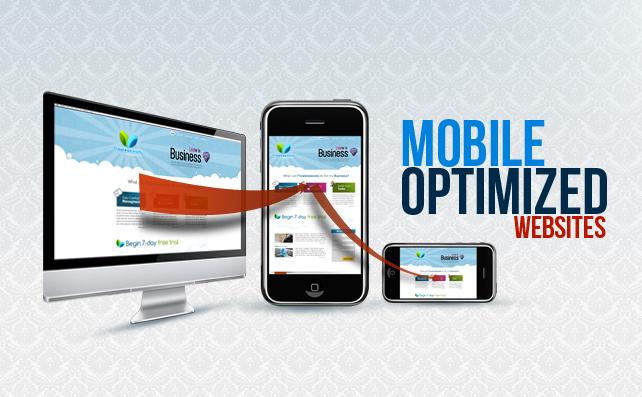
In today’s fast-paced digital landscape, ensuring that your website is mobile-optimized is not just an option—it’s a necessity. With more than half of web traffic coming from mobile devices, your WordPress site must provide a seamless experience for users on the go. Here are some key considerations to make your site stand out:
- Responsive Design: Choose a responsive theme that automatically adjusts to various screen sizes. This ensures your content looks great on any device, enhancing user satisfaction.
- Fast Loading Times: Optimize images and leverage browser caching to improve loading times. Mobile users are often on the move and may leave your site if it takes too long to load.
- Clear Navigation: Simplify your menu and use mobile-friendly navigation patterns, such as hamburger menus. This allows users to find what they need quickly, no matter where they are.
- Touch-Friendly Buttons: Make buttons larger and spaced adequately to accommodate touch gestures. This reduces frustration and encourages users to engage with your calls to action.
- Readable Text: Ensure your font sizes are legible without zooming. A minimum of 16 pixels for body text is recommended to provide an optimal reading experience.
Furthermore, understanding how users interact with your site on mobile can greatly influence your design choices. Consider conducting user testing specifically targeting mobile users to gather valuable insights. This can lead to adjustments that significantly enhance usability. Remember, the goal is to cater to the user’s needs, making it easier for them to navigate your site without any obstacles.
| Feature | Benefits |
|---|---|
| Responsive Design | Adapts to any device for a consistent experience. |
| Fast Loading | Reduces bounce rates and increases engagement. |
| Touch-Friendly | Makes interactions easier on smaller screens. |
| Clear Navigation | Helps users quickly find what they need. |
Lastly, implementing mobile analytics tools can provide insights into user behavior, allowing you to continually refine and optimize your site. Features like heatmaps can show you where users click the most, guiding your design decisions. By continually adapting to user preferences, you’ll not only meet their needs but also foster loyalty and encourage repeat visits.

Utilizing White Space to Enhance Visual Appeal and Focus
In the world of web design, the art of using white space effectively can make a significant difference in your website’s overall visual appeal. White space, often referred to as negative space, is not merely an absence of content; rather, it serves as an essential design element that enhances readability, balances visual elements, and guides the user’s focus. When strategically integrated into your WordPress site, white space can transform a cluttered layout into a clean and intentional design that captivates your audience.
Think of white space as a canvas that highlights your content. When you give elements room to breathe, you create a more inviting atmosphere. This can be achieved through:
- Margin and Padding: Use generous margins and padding to separate text from images and other elements, ensuring each piece of content stands out.
- Line Spacing: Increase line height in paragraphs to enhance readability, allowing users to navigate your text effortlessly.
- Element Spacing: Create visual breaks between sections of your site, such as headers, footers, and call-to-action buttons, to guide the reader naturally from one part of the page to another.
Another important aspect is the use of contrast. White space can enhance contrast, making text and key elements pop off the page. This not only draws attention to vital information but also cultivates a sense of elegance and professionalism. For example, a simple product description with ample white space around it will entice users to read more, while overcrowded text may deter them.
Consider implementing white space in your navigation menus as well. A clean and spacious menu design helps users find what they need quickly without feeling overwhelmed. Here’s a simple representation of how spacing can enhance menu navigation:
| Menu Item | White Space Effect |
|---|---|
| Home | Clear visual separation increases accessibility. |
| About Us | Prominent placement encourages exploration. |
| Services | Highlights offerings without distractions. |
| Contact | Inviting layout boosts engagement. |
Lastly, remember that less is often more. Embracing white space requires a mindset shift from filling every area with content to understanding the power of simplicity. By prioritizing essential information and allowing for breathing room, your site will not only look more polished but also enhance user experience. well-executed white space is not just an aesthetic choice; it’s a strategic decision that can lead to higher engagement and conversion rates on your WordPress website.

Enhancing Load Speed for a Smooth User Experience
In today’s fast-paced digital world, load speed can make or break a user’s experience on your WordPress website. A few seconds of delay can lead to increased bounce rates and decreased conversions. Therefore, optimizing load speed should be a top priority for any website owner aiming to provide a seamless browsing experience. Here are some effective strategies to enhance your site’s performance:
- Implement Caching: Utilizing caching plugins like W3 Total Cache or WP Super Cache can dramatically decrease load times by storing static copies of your pages and posts.
- Optimize Images: Compress images without sacrificing quality using tools like Smush or ShortPixel. This reduces file sizes and improves loading times.
- Minify CSS and JavaScript: Reducing the size of your CSS and JavaScript files can lead to faster downloads. Plugins such as Autoptimize can automate this process efficiently.
- Choose a Reliable Hosting Provider: Your web host plays a crucial role in speed. Opt for providers that specialize in WordPress hosting, offering optimized servers and excellent support.
- Limit HTTP Requests: Minimize the number of elements on your page—scripts, images, stylesheets—to reduce the time it takes to load them.
Additionally, monitoring your website’s performance can unveil areas needing improvement. Tools like Google PageSpeed Insights and GTmetrix provide valuable insights and suggestions tailored to your site’s needs. Regularly analyze your site, especially after implementing new features or content, to ensure optimal performance.
Here’s a quick comparison of popular caching plugins and their key features:
| Plugin | Features | Ease of Use |
|---|---|---|
| W3 Total Cache | Page caching, CDN integration, minification | Moderate |
| WP Super Cache | Static caching, easy setup | Very Easy |
| WP Rocket | File optimization, lazy loading, database cleanup | Very Easy |
remember that speed and design go hand in hand. A beautifully designed website that loads slowly can frustrate users, making them less likely to return. By prioritizing load speed in your design strategy, you ensure that visitors enjoy a seamless experience—one that keeps them engaged and eager to explore more.
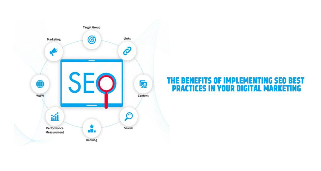
Implementing SEO Best Practices for Greater Visibility
To enhance your WordPress website’s visibility, implementing SEO best practices is crucial. By optimizing various design elements, you can significantly improve your search engine rankings and attract more organic traffic. Here are some key areas to focus on:
- Responsive Design: Ensure your website is mobile-friendly. A responsive design not only improves user experience but also positively impacts your SEO.
- Fast Loading Times: Speed is a ranking factor for Google. Optimize images, leverage caching, and minimize HTTP requests to enhance load times.
- Clear Navigation: A well-structured navigation menu helps search engines crawl your site more effectively, while also making it easier for users to find what they need.
- Use of Headers: Proper use of H1, H2, and H3 tags not only organizes your content but also highlights keywords, making it easier for search engines to understand your page.
In addition to these design elements, consider the following aspects to further boost your site’s SEO:
- Image Optimization: Use descriptive filenames and alt text for images. This helps search engines index your images, which can drive additional traffic through image search.
- Internal Linking: Create a network of links within your site to guide users to related content and allow search engines to discover more of your pages.
- SEO-Friendly URLs: Structure your URLs to be concise and keyword-rich to improve usability and search visibility.
To illustrate the impact of these practices, consider the following comparison of two hypothetical websites:
| Website A | Website B |
|---|---|
| Responsive Design | Non-Responsive Design |
| Page Load Time: 2 seconds | Page Load Time: 5 seconds |
| Well-Structured Navigation | Poor Navigation |
| Optimized Images | Unoptimized Images |
As seen in the table, Website A, with implemented SEO best practices, can potentially achieve higher rankings and better user engagement compared to Website B. By prioritizing these elements in your WordPress site design, you not only enhance the user experience but also increase your chances of being discovered through search engines.
Frequently Asked Questions (FAQ)
Q&A: 20+ Key Design Elements for an Effective WordPress Website
Q1: Why is the design of a WordPress website so important?
A1: The design of your WordPress website is crucial because it serves as the first impression for your visitors. A well-designed site not only attracts users but also keeps them engaged. It communicates your brand’s message, enhances user experience, and can significantly influence conversion rates. Simply put, good design can turn casual visitors into loyal customers!
Q2: What are the top three design elements I should focus on first?
A2: If you’re just starting out, focus on these three elements: a clean and intuitive navigation menu, a responsive design that looks great on all devices, and high-quality visuals that align with your brand. These foundational elements will make your website user-friendly and visually appealing, which is essential for keeping visitors on your site longer.
Q3: How does responsive design impact user experience?
A3: Responsive design ensures that your website looks and functions well on a variety of devices, from desktops to smartphones. This is vital because a significant portion of web traffic comes from mobile users. If your site isn’t responsive, you risk losing potential customers who may become frustrated with a poor browsing experience. A seamless experience across devices can significantly boost user satisfaction and retention.
Q4: What role do color schemes play in website design?
A4: Color schemes are more than just aesthetics; they evoke emotions and convey your brand’s personality. Choosing the right colors can enhance readability, guide user attention to key areas, and create a cohesive look across your site. Make sure your color palette aligns with your brand identity and consider color psychology to influence how visitors perceive your site.
Q5: How important is typography in web design?
A5: Typography is crucial because it affects readability and the overall vibe of your website. A well-chosen font can enhance your brand’s identity and make your content more accessible. Use legible fonts, maintain a clear hierarchy (like headings and body text), and ensure good contrast with your background. Remember, the right typography can keep users engaged with your content longer.
Q6: Should I include multimedia elements like videos and images?
A6: Absolutely! Multimedia elements like videos and images can enhance user engagement and help convey complex information more effectively. They break up text and provide visual interest, making your content more dynamic. Just be sure to optimize these elements for fast loading times, as slow media can drive visitors away.
Q7: What is the importance of whitespace in web design?
A7: Whitespace, or negative space, is essential for creating a clean, uncluttered look. It helps improve readability by allowing your content to breathe and makes it easier for users to focus on key elements. Think of it as the visual equivalent of a deep breath—without it, your website can feel cramped and overwhelming.
Q8: How can I effectively use call-to-action buttons?
A8: Call-to-action (CTA) buttons are vital for guiding visitors toward your desired actions, whether that’s signing up for a newsletter, making a purchase, or contacting you. Make them stand out using contrasting colors, clear and compelling text, and strategic placement throughout your site. The more visible and enticing your CTAs are, the more likely users will take action.
Q9: Is it necessary to have a search function on my website?
A9: Yes, a search function is often essential, especially for content-rich websites. It enhances user experience by allowing visitors to quickly find what they’re looking for without scrolling through multiple pages. A simple, intuitive search bar can make a world of difference in keeping users on your site and satisfied with their experience.
Q10: how do I ensure my website stays up-to-date with design trends?
A10: To keep your website fresh and aligned with current design trends, regularly review your site for updates, and invest time in research. Follow design blogs, subscribe to industry newsletters, and look to competitors for inspiration. Additionally, consider user feedback to make necessary adjustments. A dynamic website is always more appealing and can better serve your audience’s evolving needs.
implementing these design elements can significantly enhance the effectiveness of your WordPress website. Remember, a great design is not just about aesthetics—it’s about creating a seamless, engaging user experience that keeps visitors coming back for more!
Wrapping Up
As we wrap up our exploration of the 20+ key design elements for an effective WordPress website, it’s clear that creating an engaging and functional site is more than just aesthetics. Each element we discussed plays a crucial role in crafting an online experience that captivates visitors and converts them into loyal customers.
Remember, your website is often the first impression potential clients have of your brand, so it’s essential to make it count. By implementing these design principles, you’re not just building a website—you’re creating a digital storefront that reflects your vision, values, and unique personality.
So, don’t hesitate to take action! Whether you’re redesigning an existing site or starting from scratch, use these insights as your roadmap to success. And if you ever feel overwhelmed, just take it one step at a time. The journey to a stunning and effective WordPress site is within your reach.
Now, go ahead and make your website not just a place to visit but a destination people love to return to. Happy designing!
